UX in Action: Real Solutions for Real Interface Challenges
Solving Complex UX Challenges with Clarity and Simplicity
Designing intuitive dashboards for SaaS B2B products isn’t just about pretty visuals, it’s about making complex data and user flows feel effortless. On this page, I share some real-world examples of how I’ve tackled common (but tricky) UX scenarios. From handling long data tables on various screen sizes to streamlining form-heavy user flows, this is where you can see how I work and how I think.
Whether you’re a founder, a product manager, or another designer looking for inspiration, these practical cases show how thoughtful design can make all the difference..
Case #1: Responsive Data Tables for SaaS Dashboards
Making big data fit small screens without losing usability
Data tables are at the heart of most SaaS B2B platforms, but presenting complex datasets across devices without overwhelming users is no small feat. In this case study, I’ll walk you through my approach to designing responsive, intuitive data tables that feel at home on desktop, tablet, and mobile.
You’ll see how I handled:
✅ Information hierarchy to highlight what matters most, even on limited screen space
✅ Clean data visualization techniques to support quick scanning and comparison
✅ Color and spacing strategies to separate content clearly without clutter
✅ Context-aware actions that appear when needed and stay out of the way when not
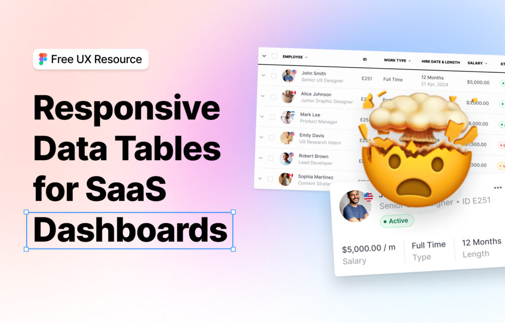
📊 A clean dashboard experience, even when the data isn’t.
Case #2: Simplifying Long Forms Without Killing the Flow
Simplifying long forms without killing the flow
Forms are often unavoidable in B2B products but that doesn’t mean they have to be painful. In this practical example, I’ll show how I restructured a long, multi-step form to guide users naturally through the process without overwhelming them.
What’s covered
✅ How I use progressive disclosure to reduce cognitive load
✅ Grouping and labeling fields for context and clarity
✅ Designing inline validation and help text for better UX
✅ Creating momentum with micro-interactions and friendly UI copy
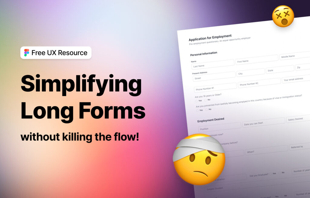
📝 Better forms = better conversions, smoother onboarding, and happier users.